This documentation is available as Markdown for AI agents and LLMs. See the full Markdown index or append .md to any documentation URL.
FloatingActionButton
Jetpack Compose 浮动操作按钮组件遵循 Material Design 3。
Expo UI 提供四种与 Material Design 3 FloatingActionButton API 相匹配的浮动操作按钮变体:
🌐 Expo UI provides four FloatingActionButton variants matching the Material Design 3 FloatingActionButton API:
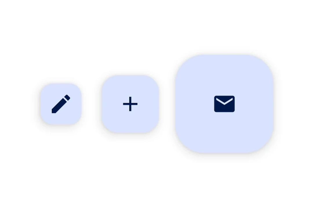
SmallFloatingActionButton— 一款紧凑型 FABFloatingActionButton— 标准 FAB(默认尺寸)LargeFloatingActionButton— 更大的FABExtendedFloatingActionButton— 一个带有图标和文本标签的悬浮操作按钮,支持动画展开/折叠
每个组件使用基于插槽的子组件(.Icon,对于 ExtendedFloatingActionButton,使用 .Text)来组合内容。
🌐 Each component uses slot-based children (.Icon and, for ExtendedFloatingActionButton, .Text) to compose content.
注意: 如果你需要在悬浮工具栏中使用多个操作按钮,请改用
HorizontalFloatingToolbar。
安装
🌐 Installation
- npx expo install @expo/uiIf you are installing this in an existing React Native app, make sure to install expo in your project.
用法
🌐 Usage
标准浮动操作按钮
🌐 Standard FloatingActionButton
import { FloatingActionButton, Host, Icon } from '@expo/ui/jetpack-compose';

export default function StandardFABExample() {
  return (
    <Host matchContents>
      <FloatingActionButton onClick={() => console.log('FAB pressed')}>
        <FloatingActionButton.Icon>
          <Icon source={require('./assets/add.xml')} />
        </FloatingActionButton.Icon>
      </FloatingActionButton>
    </Host>
  );
}
FAB 变体
🌐 FAB variants
import {
  FloatingActionButton,
  Host,
  Icon,
  LargeFloatingActionButton,
  SmallFloatingActionButton,
} from '@expo/ui/jetpack-compose';
import { View } from 'react-native';

export default function FABVariantsExample() {
  return (
    <View style={{ flexDirection: 'row', gap: 16 }}>
      <Host matchContents>
        <SmallFloatingActionButton onClick={() => {}}>
          <SmallFloatingActionButton.Icon>
            <Icon source={require('./assets/add.xml')} />
          </SmallFloatingActionButton.Icon>
        </SmallFloatingActionButton>
      </Host>
      <Host matchContents>
        <FloatingActionButton onClick={() => {}}>
          <FloatingActionButton.Icon>
            <Icon source={require('./assets/add.xml')} />
          </FloatingActionButton.Icon>
        </FloatingActionButton>
      </Host>
      <Host matchContents>
        <LargeFloatingActionButton onClick={() => {}}>
          <LargeFloatingActionButton.Icon>
            <Icon source={require('./assets/add.xml')} />
          </LargeFloatingActionButton.Icon>
        </LargeFloatingActionButton>
      </Host>
    </View>
  );
}
ExtendedFloatingActionButton
import { ExtendedFloatingActionButton, Host, Icon, Text } from '@expo/ui/jetpack-compose';
import { useState } from 'react';

export default function ExtendedFABExample() {
  const [expanded, setExpanded] = useState(true);

  return (
    <Host matchContents>
      <ExtendedFloatingActionButton expanded={expanded} onClick={() => setExpanded(v => !v)}>
        <ExtendedFloatingActionButton.Icon>
          <Icon source={require('./assets/edit.xml')} />
        </ExtendedFloatingActionButton.Icon>
        <ExtendedFloatingActionButton.Text>
          <Text>Edit</Text>
        </ExtendedFloatingActionButton.Text>
      </ExtendedFloatingActionButton>
    </Host>
  );
}
浮在内容上
🌐 Floating over content
使用 Compose 的 Box 和 align('bottomEnd') 将 FAB 完全定位在可滚动内容之上,全部在 Compose 层内。
🌐 Use a Compose Box with align('bottomEnd') to position the FAB over scrollable content entirely within the Compose layer.
import {
  Box,
  FloatingActionButton,
  Host,
  Icon,
  LazyColumn,
  ListItem,
} from '@expo/ui/jetpack-compose';
import { align, fillMaxSize, fillMaxWidth, offset } from '@expo/ui/jetpack-compose/modifiers';

export default function FloatingFABExample() {
  return (
    <Host style={{ flex: 1 }}>
      <Box modifiers={[fillMaxSize()]}>
        <LazyColumn modifiers={[fillMaxSize()]}>{/* ...list items... */}</LazyColumn>

        <FloatingActionButton
          modifiers={[align('bottomEnd'), offset(-16, -16)]}
          onClick={() => console.log('pressed')}>
          <FloatingActionButton.Icon>
            <Icon source={require('./assets/add.xml')} />
          </FloatingActionButton.Icon>
        </FloatingActionButton>
      </Box>
    </Host>
  );
}
自定义颜色
🌐 Custom color
import { ExtendedFloatingActionButton, Host, Icon, Text } from '@expo/ui/jetpack-compose';

export default function FABCustomColorExample() {
  return (
    <Host matchContents>
      <ExtendedFloatingActionButton containerColor="#E8DEF8" onClick={() => console.log('pressed')}>
        <ExtendedFloatingActionButton.Icon>
          <Icon source={require('./assets/add.xml')} />
        </ExtendedFloatingActionButton.Icon>
        <ExtendedFloatingActionButton.Text>
          <Text>New item</Text>
        </ExtendedFloatingActionButton.Text>
      </ExtendedFloatingActionButton>
    </Host>
  );
}
应用接口
🌐 API
import {
  SmallFloatingActionButton,
  FloatingActionButton,
  LargeFloatingActionButton,
  ExtendedFloatingActionButton,
} from '@expo/ui/jetpack-compose';
Components
Type: React.Element<ExtendedFloatingActionButtonProps>
Renders a Material Design 3 ExtendedFloatingActionButton with animated label expansion.
Wraps ExtendedFloatingActionButton.
Example
import { ExtendedFloatingActionButton, Host, Icon, Text } from '@expo/ui/jetpack-compose';

<Host matchContents>
  <ExtendedFloatingActionButton expanded={true} onClick={() => console.log('pressed')}>
    <ExtendedFloatingActionButton.Icon>
      <Icon source={require('./assets/edit.xml')} />
    </ExtendedFloatingActionButton.Icon>
    <ExtendedFloatingActionButton.Text>
      <Text>Edit</Text>
    </ExtendedFloatingActionButton.Text>
  </ExtendedFloatingActionButton>
</Host>
Type: React.Element<FloatingActionButtonProps>
Renders a Material Design 3 standard FloatingActionButton.
Wraps FloatingActionButton.
Example
import { FloatingActionButton, Host, Icon } from '@expo/ui/jetpack-compose';

<Host matchContents>
  <FloatingActionButton onClick={() => console.log('pressed')}>
    <FloatingActionButton.Icon>
      <Icon source={require('./assets/add.xml')} />
    </FloatingActionButton.Icon>
  </FloatingActionButton>
</Host>
ColorValueThe background color of the button container.
Defaults to FloatingActionButtonDefaults.containerColor (primary container).
Type: React.Element<LargeFloatingActionButtonProps>
Renders a Material Design 3 large FloatingActionButton.
Wraps LargeFloatingActionButton.
Example
import { LargeFloatingActionButton, Host, Icon } from '@expo/ui/jetpack-compose';

<Host matchContents>
  <LargeFloatingActionButton onClick={() => console.log('pressed')}>
    <LargeFloatingActionButton.Icon>
      <Icon source={require('./assets/add.xml')} />
    </LargeFloatingActionButton.Icon>
  </LargeFloatingActionButton>
</Host>
Props for the LargeFloatingActionButton component.
Same as FloatingActionButtonProps.
Type: React.Element<SmallFloatingActionButtonProps>
Renders a Material Design 3 small FloatingActionButton.
Wraps SmallFloatingActionButton.
Example
import { SmallFloatingActionButton, Host, Icon } from '@expo/ui/jetpack-compose';

<Host matchContents>
  <SmallFloatingActionButton onClick={() => console.log('pressed')}>
    <SmallFloatingActionButton.Icon>
      <Icon source={require('./assets/add.xml')} />
    </SmallFloatingActionButton.Icon>
  </SmallFloatingActionButton>
</Host>
Props for the SmallFloatingActionButton component.
Same as FloatingActionButtonProps.