This documentation is available as Markdown for AI agents and LLMs. See the full Markdown index or append .md to any documentation URL.
DropdownMenu
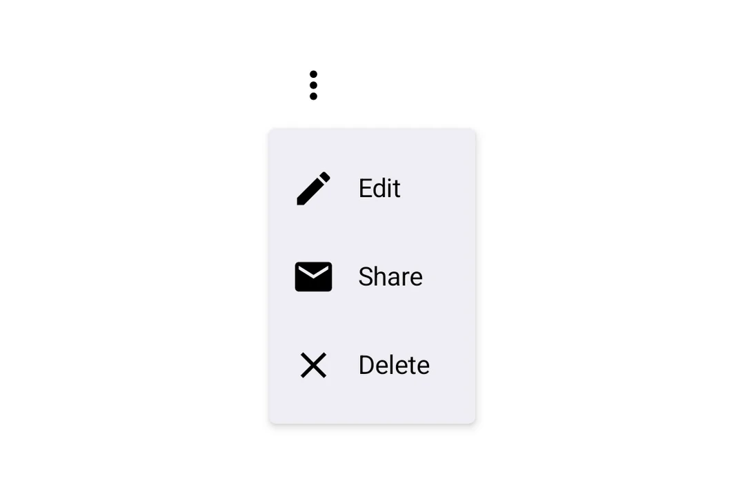
用于显示下拉菜单的 Jetpack Compose DropdownMenu 组件。
Expo UI 下拉菜单与官方 Jetpack Compose Menu API 匹配,并在触发元素被按下时显示下拉菜单。
🌐 Expo UI DropdownMenu matches the official Jetpack Compose Menu API and displays a dropdown menu when a trigger element is pressed.
安装
🌐 Installation
- npx expo install @expo/uiIf you are installing this in an existing React Native app, make sure to install expo in your project.
用法
🌐 Usage
基本下拉菜单
🌐 Basic dropdown menu
import {
  Host,
  DropdownMenu,
  DropdownMenuItem,
  OutlinedButton,
  Text,
  Icon,
} from '@expo/ui/jetpack-compose';
import { useState } from 'react';

const homeIcon = require('./assets/home.xml');

export default function BasicDropdownMenuExample() {
  const [isExpanded, setIsExpanded] = useState(false);
  return (
    <Host matchContents>
      <DropdownMenu expanded={isExpanded} onDismissRequest={() => setIsExpanded(false)}>
        <DropdownMenu.Trigger>
          <OutlinedButton onClick={() => setIsExpanded(true)}>Show Menu</OutlinedButton>
        </DropdownMenu.Trigger>
        <DropdownMenu.Items>
          <DropdownMenuItem
            onClick={() => {
              setIsExpanded(false);
              console.log('Home pressed');
            }}>
            <DropdownMenuItem.Text>
              <Text>Home</Text>
            </DropdownMenuItem.Text>
            <DropdownMenuItem.LeadingIcon>
              <Icon source={homeIcon} size={24} />
            </DropdownMenuItem.LeadingIcon>
          </DropdownMenuItem>
        </DropdownMenu.Items>
      </DropdownMenu>
    </Host>
  );
}
React Native 组件作为触发器
🌐 React Native components as trigger
你可以通过将 React Native 视图(例如 Pressable)封装在 RNHostView 中,将其用作下拉菜单的触发器。
🌐 You can use a React Native view (such as Pressable) as the dropdown's trigger by wrapping it in RNHostView.
import {
  Host,
  DropdownMenu,
  DropdownMenuItem,
  Text as ComposeText,
  RNHostView,
} from '@expo/ui/jetpack-compose';
import { useState } from 'react';
import { Pressable, Text } from 'react-native';

export default function RNTriggerDropdownMenuExample() {
  const [isExpanded, setIsExpanded] = useState(false);
  return (
    <Host matchContents>
      <DropdownMenu expanded={isExpanded} onDismissRequest={() => setIsExpanded(false)}>
        <DropdownMenu.Trigger>
          <RNHostView matchContents>
            <Pressable
              onPress={() => setIsExpanded(true)}
              style={{
                alignSelf: 'flex-start',
                paddingHorizontal: 16,
                paddingVertical: 10,
                borderRadius: 8,
                backgroundColor: '#9B59B6',
              }}>
              <Text style={{ color: 'white', fontWeight: '600' }}>RN Pressable Trigger</Text>
            </Pressable>
          </RNHostView>
        </DropdownMenu.Trigger>
        <DropdownMenu.Items>
          <DropdownMenuItem onClick={() => setIsExpanded(false)}>
            <DropdownMenuItem.Text>
              <ComposeText>Item 1</ComposeText>
            </DropdownMenuItem.Text>
          </DropdownMenuItem>
          <DropdownMenuItem onClick={() => setIsExpanded(false)}>
            <DropdownMenuItem.Text>
              <ComposeText>Item 2</ComposeText>
            </DropdownMenuItem.Text>
          </DropdownMenuItem>
        </DropdownMenu.Items>
      </DropdownMenu>
    </Host>
  );
}
长按触发
🌐 Long-press trigger
Jetpack Compose 没有专门的长按菜单原语——你可以通过在触发视图上使用 combinedClickable 修饰符加上现有的受控 DropdownMenu 来组合一个。菜单会自动锚定到触发器。
🌐 Jetpack Compose has no dedicated long-press menu primitive — you compose one from a combinedClickable modifier on the trigger view plus the existing controlled DropdownMenu. The menu anchors to the trigger automatically.
import { Host, DropdownMenu, DropdownMenuItem, Text } from '@expo/ui/jetpack-compose';
import { background, combinedClickable } from '@expo/ui/jetpack-compose/modifiers';
import { useState } from 'react';

export default function LongPressDropdownMenuExample() {
  const [isExpanded, setIsExpanded] = useState(false);
  return (
    <Host matchContents>
      <DropdownMenu expanded={isExpanded} onDismissRequest={() => setIsExpanded(false)}>
        <DropdownMenu.Trigger>
          <Text
            modifiers={[
              background('#e0e0e0'),
              combinedClickable({
                onClick: () => console.log('Short tap'),
                onLongClick: () => setIsExpanded(true),
              }),
            ]}>
            Long-press me
          </Text>
        </DropdownMenu.Trigger>
        <DropdownMenu.Items>
          <DropdownMenuItem onClick={() => setIsExpanded(false)}>
            <DropdownMenuItem.Text>
              <Text>Copy</Text>
            </DropdownMenuItem.Text>
          </DropdownMenuItem>
          <DropdownMenuItem
            elementColors={{ textColor: '#B3261E' }}
            onClick={() => setIsExpanded(false)}>
            <DropdownMenuItem.Text>
              <Text>Delete</Text>
            </DropdownMenuItem.Text>
          </DropdownMenuItem>
        </DropdownMenu.Items>
      </DropdownMenu>
    </Host>
  );
}
应用接口
🌐 API
import { DropdownMenu } from '@expo/ui/jetpack-compose';
Components
Type: React.Element<DropdownMenuProps>
Props of the DropdownMenu component.
ReactNodeThe contents of the submenu are used as an anchor for the dropdown menu. The children will be wrapped in a pressable element, which triggers opening of the dropdown menu.
() => voidCallback fired when the menu requests to be dismissed (e.g. tapping outside).
Must be provided when expanded is true to allow the menu to close.
Type: React.Element<DropdownMenuItemProps>
A dropdown menu item component that wraps Compose's DropdownMenuItem.
Should be used inside DropdownMenu.Items or ExposedDropdownMenu.
Type: React.Element<{
children: ReactNode
}>
Container for items displayed in the dropdown menu.
Children should be DropdownMenuItem components or other native views.