This documentation is available as Markdown for AI agents and LLMs. See the full Markdown index or append .md to any documentation URL.
小吃吧
出现在屏幕底部的简短通知,用于在不打断用户的情况下提供反馈。
Expo UI 提供了两个组件,它们与 Jetpack Compose 的 Snackbar API 相对应:
🌐 Expo UI exposes two components that mirror Jetpack Compose's Snackbar APIs:
SnackbarHost封装了 Compose 的 SnackbarHost 和 SnackbarHostState。在布局中放置一次,然后在ref上调用showSnackbar。Snackbar 会根据duration自动消失,也可以通过操作按钮或可选的关闭图标手动关闭。Snackbar是SnackbarHost的仅样式子元素。传入一个以覆盖颜色或将操作放在新行上。
安装
🌐 Installation
- npx expo install @expo/uiIf you are installing this in an existing React Native app, make sure to install expo in your project.
用法
🌐 Usage
显示一个 snackbar
🌐 Showing a snackbar
在你的布局中放置一个 SnackbarHost,然后在它的引用上调用 showSnackbar 来显示一条消息。返回的 Promise 会在 snackbar 消失后以 'actionPerformed' 或 'dismissed' 作为结果解决。
🌐 Place a SnackbarHost once in your layout and call showSnackbar on its ref to display a message. The returned promise resolves with 'actionPerformed' or 'dismissed' once the snackbar goes away.
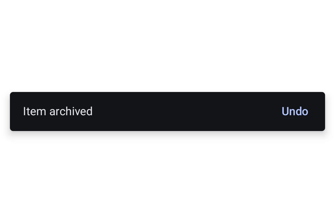
import { useRef } from 'react';
import {
  Box,
  Button,
  Column,
  Host,
  SnackbarHost,
  Text,
  type SnackbarHostRef,
} from '@expo/ui/jetpack-compose';
import { align, fillMaxSize, fillMaxWidth, padding } from '@expo/ui/jetpack-compose/modifiers';

export default function SnackbarExample() {
  const hostRef = useRef<SnackbarHostRef>(null);

  const onArchive = async () => {
    const result = await hostRef.current?.showSnackbar({
      message: 'Item archived',
      actionLabel: 'Undo',
      duration: 'short',
    });
    if (result === 'actionPerformed') {
      // The user tapped Undo, restore the item.
    }
  };

  return (
    <Host style={{ flex: 1 }}>
      <Box modifiers={[fillMaxSize()]}>
        <Column modifiers={[padding(16, 16, 16, 16)]}>
          <Button onClick={onArchive}>
            <Text>Archive</Text>
          </Button>
        </Column>

        <Box modifiers={[align('bottomCenter'), fillMaxWidth()]}>
          <SnackbarHost ref={hostRef} />
        </Box>
      </Box>
    </Host>
  );
}
自定义样式
🌐 Custom styling
将Snackbar子项传递给SnackbarHost以覆盖颜色或将操作放在新行。Snackbar本身不包含内容,消息和操作来自每个showSnackbar调用。
🌐 Pass a Snackbar child to SnackbarHost to override colors or place the action on a new line. The Snackbar itself takes no content, the message and action come from each showSnackbar call.
import { useRef } from 'react';
import {
  Box,
  Button,
  Column,
  Host,
  Snackbar,
  SnackbarHost,
  Text,
  type SnackbarHostRef,
} from '@expo/ui/jetpack-compose';
import { align, fillMaxSize, fillMaxWidth, padding } from '@expo/ui/jetpack-compose/modifiers';

export default function StyledSnackbar() {
  const hostRef = useRef<SnackbarHostRef>(null);

  const onSave = () => {
    hostRef.current?.showSnackbar({
      message: 'Saved',
      actionLabel: 'Undo',
    });
  };

  return (
    <Host style={{ flex: 1 }}>
      <Box modifiers={[fillMaxSize()]}>
        <Column modifiers={[padding(16, 16, 16, 16)]}>
          <Button onClick={onSave}>
            <Text>Save</Text>
          </Button>
        </Column>

        <Box modifiers={[align('bottomCenter'), fillMaxWidth()]}>
          <SnackbarHost ref={hostRef}>
            <Snackbar
              containerColor="#1E1E2E"
              contentColor="#CDD6F4"
              actionContentColor="#F38BA8"
              dismissActionContentColor="#CDD6F4"
            />
          </SnackbarHost>
        </Box>
      </Box>
    </Host>
  );
}
应用接口
🌐 API
import { Snackbar, SnackbarHost } from '@expo/ui/jetpack-compose';
Components
Type: React.Element<SnackbarProps>
Styling configuration for the snackbar shown by SnackbarHost. Pass as a
child to override colors or place the action on a new line.
boolean • Default: falseWhether the action should be placed on a new line below the message. Useful for long action labels.
ColorValueThe content color used for the dismiss-action icon button.
Type: React.Element<SnackbarHostProps>
A Material 3 SnackbarHost
that displays snackbars triggered via its ref's showSnackbar method.
ReactNodeOptional Snackbar child supplying styling for shown snackbars. Mirrors
Compose's SnackbarHost(hostState) { data -> Snackbar(data, ...) } lambda.
Types
Literal Type: string
How long the snackbar is shown. Mirrors Compose's SnackbarDuration enum.
Acceptable values are: 'short' | 'long' | 'indefinite'
| Property | Type | Description |
|---|---|---|
| showSnackbar | (options: SnackbarShowOptions) => Promise<SnackbarResult> | Shows a snackbar and resolves with |
Literal Type: string
Reason a snackbar invocation resolved. Mirrors Compose's SnackbarResult enum.
Acceptable values are: 'actionPerformed' | 'dismissed'
| Property | Type | Description |
|---|---|---|
| actionLabel(optional) | string | Label for the optional action button. When omitted, no action button is shown. |
| duration(optional) | SnackbarDuration | How long to show the snackbar. Defaults to |
| message | string | The message body of the snackbar. |
| withDismissAction(optional) | boolean | Whether to show a trailing close (X) icon button to dismiss the snackbar. Default: false |