This documentation is available as Markdown for AI agents and LLMs. See the full Markdown index or append .md to any documentation URL.
BadgedBox
一个用于在内容上叠加徽章的 Jetpack Compose BadgedBox 组件。
Android
Included in Expo Go
Recommended version:
~57.0.3
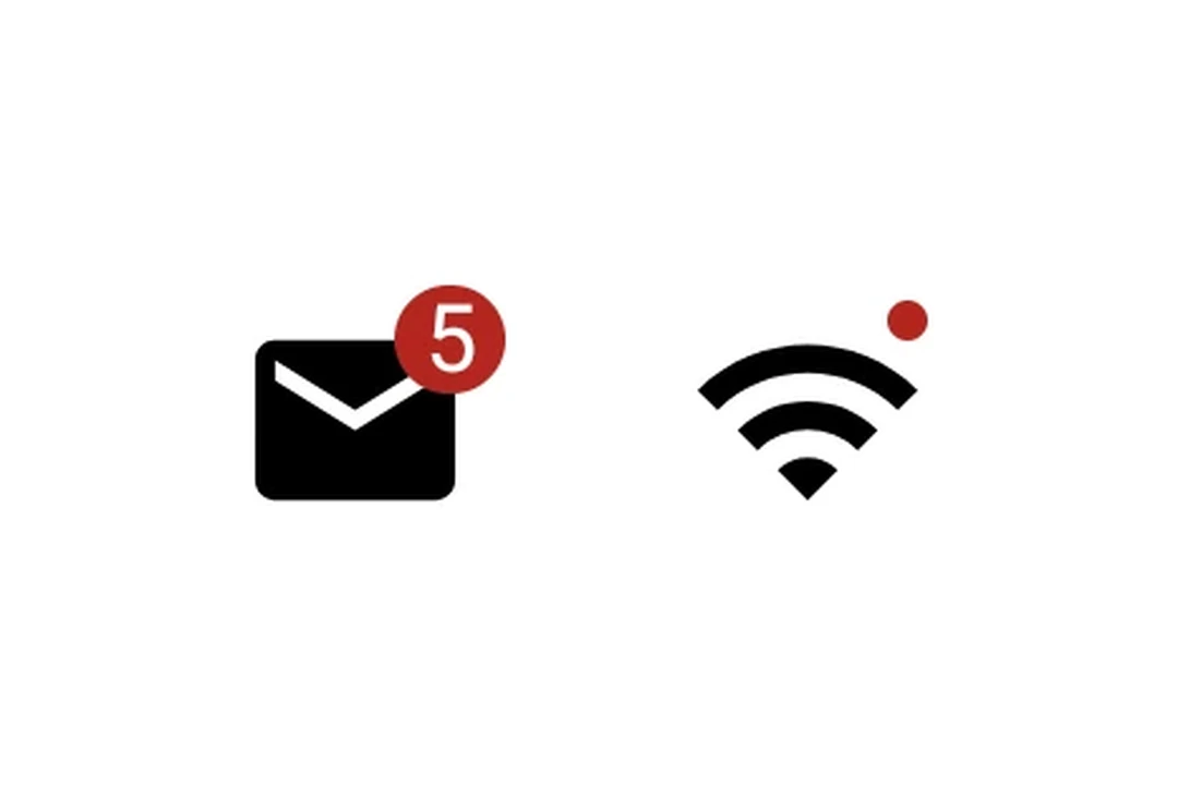
Expo UI BadgedBox 与官方 Jetpack Compose BadgedBox API 相匹配。它会在图标等内容的顶部覆盖一个徽章。
🌐 Expo UI BadgedBox matches the official Jetpack Compose BadgedBox API. It overlays a badge on top of content such as an icon.
安装
🌐 Installation
Terminal
- npx expo install @expo/uiIf you are installing this in an existing React Native app, make sure to install expo in your project.
用法
🌐 Usage
带徽章计数的图标
🌐 Icon with badge count
IconWithBadge.tsx
import { Host, Badge, BadgedBox, Icon, Text } from '@expo/ui/jetpack-compose';

// Replace with your own vector drawable asset
const mailIcon = require('./assets/mail.xml');

export default function IconWithBadge() {
  return (
    <Host matchContents>
      <BadgedBox>
        <BadgedBox.Badge>
          <Badge>
            <Text>5</Text>
          </Badge>
        </BadgedBox.Badge>
        <Icon source={mailIcon} size={24} />
      </BadgedBox>
    </Host>
  );
}
交互式计数器
🌐 Interactive counter
InteractiveBadge.tsx
import { useState } from 'react';
import { Host, Badge, BadgedBox, Icon, Button, Text, Column } from '@expo/ui/jetpack-compose';

// Replace with your own vector drawable asset
const cartIcon = require('./assets/cart.xml');

export default function InteractiveBadge() {
  const [count, setCount] = useState(0);

  return (
    <Host matchContents>
      <Column>
        <BadgedBox>
          <BadgedBox.Badge>
            {count > 0 ? (
              <Badge>
                <Text>{String(count)}</Text>
              </Badge>
            ) : null}
          </BadgedBox.Badge>
          <Icon source={cartIcon} size={24} />
        </BadgedBox>
        <Button onClick={() => setCount(c => c + 1)}>
          <Text>Add item</Text>
        </Button>
      </Column>
    </Host>
  );
}
应用接口
🌐 API
import { BadgedBox } from '@expo/ui/jetpack-compose';
Component
Type: React.Element<BadgedBoxProps>
A badged box matching Compose's BadgedBox.
Overlays a badge on top of content (for example, an icon).