This documentation is available as Markdown for AI agents and LLMs. See the full Markdown index or append .md to any documentation URL.
DockedSearchBar
一个 Jetpack Compose DockedSearchBar 组件,用于显示内联搜索输入框。
Expo UI DockedSearchBar 与官方 Jetpack Compose SearchBar API 匹配,并显示一个搜索输入框,该输入框保持固定在其父布局中,而不是展开到全屏。
🌐 Expo UI DockedSearchBar matches the official Jetpack Compose SearchBar API and displays a search input that remains anchored in its parent layout rather than expanding to full screen.
安装
🌐 Installation
- npx expo install @expo/uiIf you are installing this in an existing React Native app, make sure to install expo in your project.
用法
🌐 Usage
基础停靠搜索栏
🌐 Basic docked search bar
import { useState } from 'react';
import { Host, DockedSearchBar } from '@expo/ui/jetpack-compose';

export default function BasicDockedSearchBarExample() {
  const [query, setQuery] = useState('');

  return (
    <Host matchContents>
      <DockedSearchBar onQueryChange={setQuery} />
    </Host>
  );
}
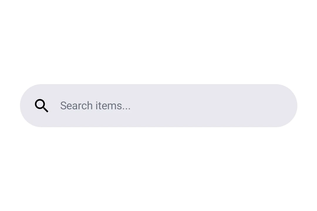
带占位符和前导图标
🌐 With placeholder and leading icon
使用 DockedSearchBar.Placeholder 和 DockedSearchBar.LeadingIcon 插槽组件来自定义搜索栏的外观。
🌐 Use the DockedSearchBar.Placeholder and DockedSearchBar.LeadingIcon slot components to customize the search bar appearance.
import { useState } from 'react';
import { Host, DockedSearchBar, Text } from '@expo/ui/jetpack-compose';

export default function DockedSearchBarWithSlotsExample() {
  const [query, setQuery] = useState('');

  return (
    <Host matchContents>
      <DockedSearchBar onQueryChange={setQuery}>
        <DockedSearchBar.Placeholder>
          <Text>Search items...</Text>
        </DockedSearchBar.Placeholder>
        <DockedSearchBar.LeadingIcon>
          <Text>🔍</Text>
        </DockedSearchBar.LeadingIcon>
      </DockedSearchBar>
    </Host>
  );
}
应用接口
🌐 API
import { DockedSearchBar } from '@expo/ui/jetpack-compose';
Components
Type: React.Element<DockedSearchBarProps>
Type: React.Element<LeadingIconProps>
Type: React.Element<PlaceholderProps>