This documentation is available as Markdown for AI agents and LLMs. See the full Markdown index or append .md to any documentation URL.
文本
用于显示样式化文本的 Jetpack Compose Text 组件。
信息 有关跨平台使用,请参阅通用
Text—— 它会根据平台呈现相应的原生组件。
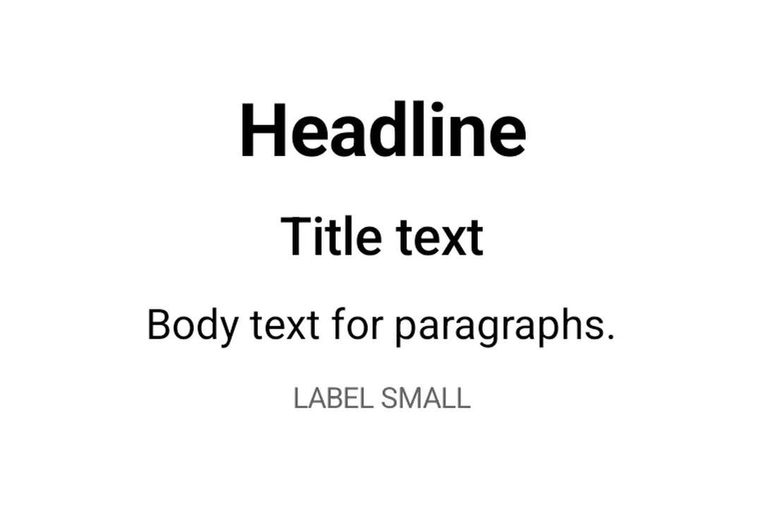
Expo UI 文本与官方 Jetpack Compose 文本样式 API 匹配,并使用 Material 3 排版样式、自定义字体和文本格式选项显示文本。
🌐 Expo UI Text matches the official Jetpack Compose Text styling API and displays text with Material 3 typography styles, custom fonts, and text formatting options.
安装
🌐 Installation
- npx expo install @expo/uiIf you are installing this in an existing React Native app, make sure to install expo in your project.
用法
🌐 Usage
基础文本
🌐 Basic text
import { Host, Text } from '@expo/ui/jetpack-compose';

export default function BasicTextExample() {
  return (
    <Host matchContents>
      <Text>Hello, world!</Text>
    </Host>
  );
}
排版样式
🌐 Typography styles
将 style 属性与 typography 一起使用以应用 Material 3 排版预设。
🌐 Use the style prop with typography to apply Material 3 typography presets.
import { Host, Text, Column } from '@expo/ui/jetpack-compose';
import { paddingAll } from '@expo/ui/jetpack-compose/modifiers';

export default function TypographyExample() {
  return (
    <Host matchContents>
      <Column modifiers={[paddingAll(16)]}>
        <Text style={{ typography: 'displayLarge' }}>Display Large</Text>
        <Text style={{ typography: 'headlineMedium' }}>Headline Medium</Text>
        <Text style={{ typography: 'bodySmall' }}>Body Small</Text>
        <Text style={{ typography: 'labelLarge' }}>Label Large</Text>
      </Column>
    </Host>
  );
}
具有最大行数和溢出的文本
🌐 Text with maxLines and overflow
使用 maxLines 和 overflow 控制文本截断。
🌐 Control text truncation with maxLines and overflow.
import { Host, Text } from '@expo/ui/jetpack-compose';
import { width } from '@expo/ui/jetpack-compose/modifiers';

export default function TextOverflowExample() {
  return (
    <Host matchContents>
      <Text maxLines={2} overflow="ellipsis" modifiers={[width(200)]}>
        This is a long paragraph of text that will be truncated after two lines with an ellipsis at
        the end to indicate there is more content.
      </Text>
    </Host>
  );
}
样式化文本
🌐 Styled text
应用自定义文本样式,包括字体粗细、样式、大小和装饰。
🌐 Apply custom text styles including font weight, style, size, and decoration.
import { Host, Text, Column } from '@expo/ui/jetpack-compose';
import { paddingAll } from '@expo/ui/jetpack-compose/modifiers';

export default function StyledTextExample() {
  return (
    <Host matchContents>
      <Column modifiers={[paddingAll(16)]}>
        <Text style={{ fontWeight: 'bold', fontSize: 20 }}>Bold text</Text>
        <Text style={{ fontStyle: 'italic' }}>Italic text</Text>
        <Text style={{ textDecoration: 'underline' }}>Underlined text</Text>
        <Text style={{ letterSpacing: 4 }}>Spaced out text</Text>
        <Text color="#E91E63" style={{ fontSize: 18, textAlign: 'center' }}>
          Colored and centered
        </Text>
      </Column>
    </Host>
  );
}
嵌套文本
🌐 Nested text
嵌套 <Text> 组件以对句子的部分应用行内样式。子 span 会继承父元素的样式。例如,一个加粗的父元素包含一个斜体的子元素时,子元素会同时呈现加粗和斜体。
🌐 Nest <Text> components to apply inline styles to parts of a sentence. Child spans inherit styles from their parent. For example, a bold parent with an italic child renders the child as bold and italic.
import { Host, Text, Column } from '@expo/ui/jetpack-compose';
import { paddingAll } from '@expo/ui/jetpack-compose/modifiers';

export default function NestedTextExample() {
  return (
    <Host matchContents>
      <Column modifiers={[paddingAll(16)]}>
        {/* Bold parent, italic child inherits bold */}
        <Text style={{ fontWeight: 'bold' }}>
          Hello <Text style={{ fontStyle: 'italic' }}>world</Text>!
        </Text>

        {/* Mixed inline styles */}
        <Text style={{ fontSize: 16 }}>
          Normal, <Text style={{ fontStyle: 'italic' }}>italic</Text>,{' '}
          <Text style={{ fontWeight: 'bold' }}>bold</Text>, and{' '}
          <Text style={{ textDecoration: 'underline' }}>underlined</Text>
        </Text>

        {/* Color and background overrides per span */}
        <Text style={{ fontSize: 18 }}>
          Click{' '}
          <Text color="#007AFF" style={{ fontWeight: 'bold' }}>
            here
          </Text>{' '}
          or <Text style={{ background: '#FFEB3B' }}>highlighted</Text>
        </Text>

        {/* Deep nesting — styles accumulate */}
        <Text style={{ fontWeight: 'bold' }}>
          Bold{' '}
          <Text style={{ fontStyle: 'italic' }}>
            bold+italic <Text style={{ textDecoration: 'underline' }}>bold+italic+underline</Text>
          </Text>
        </Text>
      </Column>
    </Host>
  );
}
自定义字体
🌐 Custom fonts
通过将字体系列名称传递给 style.fontFamily 来使用通过 expo-font 加载的字体。
🌐 Use fonts loaded via expo-font by passing the font family name to style.fontFamily.
import { Host, Text, Column } from '@expo/ui/jetpack-compose';
import { paddingAll } from '@expo/ui/jetpack-compose/modifiers';

export default function CustomFontExample() {
  return (
    <Host matchContents>
      <Column modifiers={[paddingAll(16)]}>
        <Text style={{ fontFamily: 'serif', fontSize: 16 }}>System serif font</Text>
        <Text style={{ fontFamily: 'monospace', fontSize: 16 }}>System monospace font</Text>
        <Text style={{ fontFamily: 'Inter-Bold', fontSize: 16 }}>Custom Inter Bold font</Text>
      </Column>
    </Host>
  );
}
应用接口
🌐 API
import { Text } from '@expo/ui/jetpack-compose';
Component
Type: React.Element<TextProps>
Renders a Text component using Jetpack Compose.
ReactNodeThe text content to display. Can be a string, number, or nested Text components
for inline styled spans.
numberAn optional maximum number of lines for the text to span, wrapping if necessary. If the text exceeds the given number of lines, it will be truncated according to overflow.
booleanWhether the text should break at soft line breaks. If false, the glyphs in the text will be positioned as if there was unlimited horizontal space.
TextStyleStyle configuration for the text. Corresponds to Jetpack Compose's TextStyle parameter.
Types
Literal Type: string
Text alignment options.
Acceptable values are: 'left' | 'right' | 'center' | 'justify' | 'start' | 'end'
Literal Type: string
Text decoration options.
Acceptable values are: 'none' | 'underline' | 'lineThrough'
Literal Type: string
Font family for text styling. Built-in system families: 'default', 'sansSerif', 'serif', 'monospace', 'cursive'. Custom font families loaded via expo-font can be referenced by name (for example, 'Inter-Bold').
Acceptable values are: 'default' | 'sansSerif' | 'serif' | 'monospace' | 'cursive'
Literal Type: string
Font style options for text styling.
Acceptable values are: 'normal' | 'italic'
Literal Type: string
Font weight options for text styling.
Acceptable values are: 'normal' | 'bold' | '100' | '200' | '300' | '400' | '500' | '600' | '700' | '800' | '900'
Literal Type: string
Line break strategy options.
- 'simple': Basic line breaking.
- 'heading': Optimized for short text like headings.
- 'paragraph': Produces more balanced line lengths for body text.
Acceptable values are: 'simple' | 'heading' | 'paragraph'
Literal Type: string
Text overflow behavior options.
- 'clip': Clips the overflowing text to fit its container
- 'ellipsis': Uses an ellipsis to indicate that the text has overflowed
- 'visible': Renders overflow text outside its container
Acceptable values are: 'clip' | 'ellipsis' | 'visible'
Text shadow configuration. Corresponds to Jetpack Compose's Shadow class.
| Property | Type | Description |
|---|---|---|
| blurRadius(optional) | number | The blur radius of the shadow in dp. |
| color(optional) | string | The color of the shadow. |
| offsetX(optional) | number | The horizontal offset of the shadow in dp. |
| offsetY(optional) | number | The vertical offset of the shadow in dp. |
Shared span-level style properties used by both TextStyle and TextSpanRecord.
Adding a property here ensures it's available on both parent text and nested spans.
| Property | Type | Description |
|---|---|---|
| background(optional) | string | The background color behind the text. |
| fontFamily(optional) | TextFontFamily | The font family. |
| fontSize(optional) | number | The font size in sp (scale-independent pixels). |
| fontStyle(optional) | TextFontStyle | The font style of the text. |
| fontWeight(optional) | TextFontWeight | The font weight of the text. |
| letterSpacing(optional) | number | The letter spacing in sp. |
| shadow(optional) | TextShadow | The shadow applied to the text. |
| textDecoration(optional) | TextDecoration | The text decoration. |
Text style properties that can be applied to text.
Corresponds to Jetpack Compose's TextStyle.
Type: TextSpanStyleBase extended by:
| Property | Type | Description |
|---|---|---|
| lineBreak(optional) | TextLineBreak | The line break strategy. |
| lineHeight(optional) | number | The line height in sp. |
| textAlign(optional) | TextAlign | The text alignment. |
| typography(optional) | TypographyStyle | Material 3 Typography style to use as the base style. When specified, applies the predefined Material 3 typography style. Other properties in this style object will override specific values from the typography. |
Literal Type: string
Material 3 Typography scale styles. Corresponds to MaterialTheme.typography in Jetpack Compose.
Acceptable values are: 'displayLarge' | 'displayMedium' | 'displaySmall' | 'headlineLarge' | 'headlineMedium' | 'headlineSmall' | 'titleLarge' | 'titleMedium' | 'titleSmall' | 'bodyLarge' | 'bodyMedium' | 'bodySmall' | 'labelLarge' | 'labelMedium' | 'labelSmall'