This documentation is available as Markdown for AI agents and LLMs. See the full Markdown index or append .md to any documentation URL.
PullToRefreshBox
一个用于下拉刷新的 Jetpack Compose PullToRefreshBox 组件。
信息 对于带有下拉刷新功能的跨平台列表,请参见
List— 在 Android 上基于PullToRefreshBox构建。
Expo UI PullToRefreshBox 与官方的 Jetpack Compose PullToRefreshBox API 匹配。它封装可滚动内容,并在下拉时显示刷新指示器。
安装
🌐 Installation
- npx expo install @expo/uiIf you are installing this in an existing React Native app, make sure to install expo in your project.
用法
🌐 Usage
基础下拉刷新
🌐 Basic pull to refresh
将可滚动内容封装在 PullToRefreshBox 中以添加下拉刷新功能。
🌐 Wrap scrollable content in a PullToRefreshBox to add pull-to-refresh behavior.
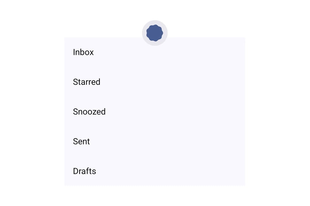
import { useState, useCallback } from 'react';
import { Host, PullToRefreshBox, LazyColumn, ListItem } from '@expo/ui/jetpack-compose';

export default function BasicPullToRefresh() {
  const [refreshing, setRefreshing] = useState(false);

  const onRefresh = useCallback(() => {
    setRefreshing(true);
    setTimeout(() => {
      setRefreshing(false);
    }, 2000);
  }, []);

  return (
    <Host style={{ height: 400 }}>
      <PullToRefreshBox isRefreshing={refreshing} onRefresh={onRefresh}>
        <LazyColumn>
          <ListItem>
            <ListItem.HeadlineContent>Item 1</ListItem.HeadlineContent>
          </ListItem>
          <ListItem>
            <ListItem.HeadlineContent>Item 2</ListItem.HeadlineContent>
          </ListItem>
          <ListItem>
            <ListItem.HeadlineContent>Item 3</ListItem.HeadlineContent>
          </ListItem>
          <ListItem>
            <ListItem.HeadlineContent>Item 4</ListItem.HeadlineContent>
          </ListItem>
          <ListItem>
            <ListItem.HeadlineContent>Item 5</ListItem.HeadlineContent>
          </ListItem>
        </LazyColumn>
      </PullToRefreshBox>
    </Host>
  );
}
自定义指标颜色
🌐 Custom indicator colors
使用 indicator 属性来自定义加载动画和容器的颜色。
🌐 Use the indicator prop to customize the spinner and container colors.
import { useState, useCallback } from 'react';
import { Host, PullToRefreshBox, LazyColumn, ListItem } from '@expo/ui/jetpack-compose';

export default function CustomIndicatorColors() {
  const [refreshing, setRefreshing] = useState(false);

  const onRefresh = useCallback(() => {
    setRefreshing(true);
    setTimeout(() => {
      setRefreshing(false);
    }, 2000);
  }, []);

  return (
    <Host style={{ height: 400 }}>
      <PullToRefreshBox
        isRefreshing={refreshing}
        onRefresh={onRefresh}
        indicator={{ color: '#6200EE', containerColor: '#F5F5F5' }}>
        <LazyColumn>
          <ListItem>
            <ListItem.HeadlineContent>Item 1</ListItem.HeadlineContent>
          </ListItem>
          <ListItem>
            <ListItem.HeadlineContent>Item 2</ListItem.HeadlineContent>
          </ListItem>
          <ListItem>
            <ListItem.HeadlineContent>Item 3</ListItem.HeadlineContent>
          </ListItem>
        </LazyColumn>
      </PullToRefreshBox>
    </Host>
  );
}
应用接口
🌐 API
import { PullToRefreshBox } from '@expo/ui/jetpack-compose';
Component
Type: React.Element<PullToRefreshBoxProps>
A pull-to-refresh container that wraps scrollable content and shows a refresh indicator when pulled,
matching Compose's PullToRefreshBox.
ContentAlignment • Default: 'topStart'Alignment of children within the box.
PullToRefreshIndicatorPropsConfiguration for the loading indicator shown during pull-to-refresh.