This documentation is available as Markdown for AI agents and LLMs. See the full Markdown index or append .md to any documentation URL.
DatePicker
用于选择日期和时间的 SwiftUI 日期选择器组件。
Expo UI 日期选择器与官方 SwiftUI DatePicker API 一致,并支持通过 datePickerStyle 修改器进行样式设置。
🌐 Expo UI DatePicker matches the official SwiftUI DatePicker API and supports styling via the datePickerStyle modifier.
安装
🌐 Installation
- npx expo install @expo/uiIf you are installing this in an existing React Native app, make sure to install expo in your project.
日期选择器
🌐 Date picker
import { useState } from 'react';
import { Host, DatePicker } from '@expo/ui/swift-ui';

export default function DatePickerExample() {
  const [selectedDate, setSelectedDate] = useState(new Date());

  return (
    <Host matchContents>
      <DatePicker
        title="选择日期"
        selection={selectedDate}
        displayedComponents={['date']}
        onDateChange={date => {
          setSelectedDate(date);
        }}
      />
    </Host>
  );
}
时间选择器
🌐 Time picker
import { useState } from 'react';
import { Host, DatePicker } from '@expo/ui/swift-ui';

export default function TimePickerExample() {
  const [selectedDate, setSelectedDate] = useState(new Date());

  return (
    <Host matchContents>
      <DatePicker
        title="选择时间"
        selection={selectedDate}
        displayedComponents={['hourAndMinute']}
        onDateChange={date => {
          setSelectedDate(date);
        }}
      />
    </Host>
  );
}
日期和时间选择器
🌐 Date and time picker
import { useState } from 'react';
import { Host, DatePicker } from '@expo/ui/swift-ui';

export default function DateTimePickerExample() {
  const [selectedDate, setSelectedDate] = useState(new Date());

  return (
    <Host matchContents>
      <DatePicker
        title="选择日期和时间"
        selection={selectedDate}
        displayedComponents={['date', 'hourAndMinute']}
        onDateChange={date => {
          setSelectedDate(date);
        }}
      />
    </Host>
  );
}
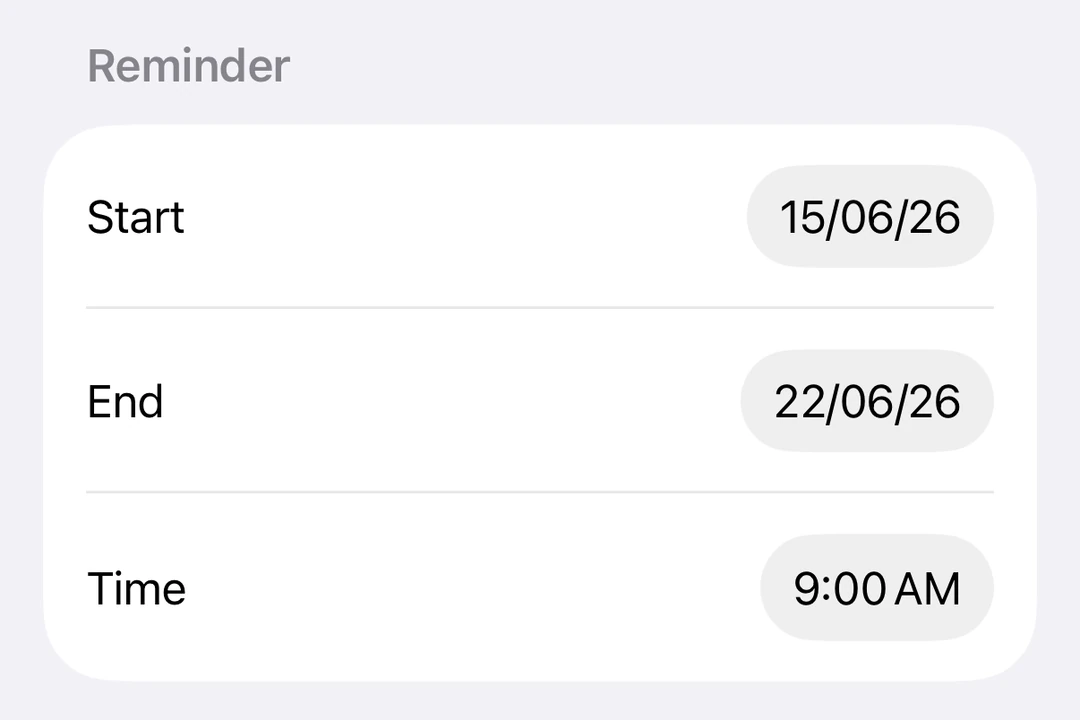
带日期范围
🌐 With date range
import { useState } from 'react';
import { Host, DatePicker } from '@expo/ui/swift-ui';

export default function DateRangePickerExample() {
  const [selectedDate, setSelectedDate] = useState(new Date());

  return (
    <Host matchContents>
      <DatePicker
        title="选择日期"
        selection={selectedDate}
        displayedComponents={['date']}
        range={{
          start: new Date(2024, 0, 1),
          end: new Date(2024, 11, 31),
        }}
        onDateChange={date => {
          setSelectedDate(date);
        }}
      />
    </Host>
  );
}
使用修饰符进行样式化
🌐 Styling with modifiers
你可以使用 datePickerStyle 修饰符来更改选择器的外观。可用的样式有:automatic、compact、graphical 和 wheel。
🌐 You can use the datePickerStyle modifier to change the appearance of the picker. Available styles are: automatic, compact, graphical, and wheel.
import { useState } from 'react';
import { Host, DatePicker } from '@expo/ui/swift-ui';
import { datePickerStyle } from '@expo/ui/swift-ui/modifiers';

export default function WheelDatePickerExample() {
  const [selectedDate, setSelectedDate] = useState(new Date());

  return (
    <Host matchContents>
      <DatePicker
        modifiers={[datePickerStyle('wheel')]}
        title="选择日期"
        selection={selectedDate}
        displayedComponents={['date']}
        onDateChange={date => {
          setSelectedDate(date);
        }}
      />
    </Host>
  );
}
import { useState } from 'react';
import { Host, DatePicker } from '@expo/ui/swift-ui';
import { datePickerStyle } from '@expo/ui/swift-ui/modifiers';

export default function GraphicalDatePickerExample() {
  const [selectedDate, setSelectedDate] = useState(new Date());

  return (
    <Host matchContents>
      <DatePicker
        modifiers={[datePickerStyle('graphical')]}
        title="选择日期"
        selection={selectedDate}
        displayedComponents={['date']}
        onDateChange={date => {
          setSelectedDate(date);
        }}
      />
    </Host>
  );
}
禁用的选择器
🌐 Disabled picker
你可以使用 disabled 修饰符使选择器不可交互。
🌐 You can make the picker non-interactive using the disabled modifier.
import { useState } from 'react';
import { Host, DatePicker } from '@expo/ui/swift-ui';
import { disabled } from '@expo/ui/swift-ui/modifiers';

export default function DisabledDatePickerExample() {
  const [selectedDate, setSelectedDate] = useState(new Date());

  return (
    <Host matchContents>
      <DatePicker
        title="选择日期"
        selection={selectedDate}
        displayedComponents={['date']}
        onDateChange={date => {
          setSelectedDate(date);
        }}
        modifiers={[disabled()]}
      />
    </Host>
  );
}
自定义区域设置
🌐 Custom locale
使用 locale 键配合 environment 修饰符可以在特定语言环境下显示选择器。
🌐 Apply the environment modifier with the locale key to display the picker in a specific locale.
import { useState } from 'react';
import { Host, DatePicker } from '@expo/ui/swift-ui';
import { environment } from '@expo/ui/swift-ui/modifiers';

export default function LocaleDatePickerExample() {
  const [selectedDate, setSelectedDate] = useState(new Date());

  return (
    <Host matchContents>
      <DatePicker
        title="选择日期"
        selection={selectedDate}
        displayedComponents={['date']}
        onDateChange={date => {
          setSelectedDate(date);
        }}
        modifiers={[environment('locale', 'fr_FR')]}
      />
    </Host>
  );
}
自定义时区
🌐 Custom time zone
使用 timeZone 键应用 environment 修饰符以在特定的 IANA 时区显示选择器。
🌐 Apply the environment modifier with the timeZone key to display the picker in a specific IANA time zone.
import { useState } from 'react';
import { Host, DatePicker } from '@expo/ui/swift-ui';
import { environment } from '@expo/ui/swift-ui/modifiers';

export default function TimeZoneDatePickerExample() {
  const [selectedDate, setSelectedDate] = useState(new Date());

  return (
    <Host matchContents>
      <DatePicker
        title="东京时间"
        selection={selectedDate}
        displayedComponents={['date', 'hourAndMinute']}
        onDateChange={date => {
          setSelectedDate(date);
        }}
        modifiers={[environment('timeZone', 'Asia/Tokyo')]}
      />
    </Host>
  );
}
应用接口
🌐 API
import { DatePicker } from '@expo/ui/swift-ui';
Component
Type: React.Element<DatePickerProps>
Renders a SwiftUI DatePicker component.
DatePickerComponent[] • Default: ['date']The components to display: 'date' and/or 'hourAndMinute'.