This documentation is available as Markdown for AI agents and LLMs. See the full Markdown index or append .md to any documentation URL.
弹出框
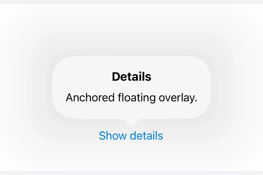
一个用于在浮动覆盖层中显示内容的 SwiftUI 弹出组件。
Expo UI 弹出框与官方 SwiftUI Popover API 相匹配,并提供了一种在浮动覆盖层中渲染内容的方法,该覆盖层以触发元素为锚点。
安装
🌐 Installation
- npx expo install @expo/uiIf you are installing this in an existing React Native app, make sure to install expo in your project.
用法
🌐 Usage
基本弹出框
🌐 Basic popover
import { useState } from 'react';
import { Host, Button, Popover, Text, VStack } from '@expo/ui/swift-ui';
import { padding } from '@expo/ui/swift-ui/modifiers';

export default function BasicPopoverExample() {
  const [isPresented, setIsPresented] = useState(false);

  return (
    <Host matchContents>
      <Popover
        isPresented={isPresented}
        onStateChange={({ isPresented }) => setIsPresented(isPresented)}>
        <Popover.Trigger>
          <Button label="Show Popover" onPress={() => setIsPresented(true)} />
        </Popover.Trigger>
        <Popover.Content>
          <VStack modifiers={[padding({ all: 16 })]}>
            <Text>Hello from Popover!</Text>
          </VStack>
        </Popover.Content>
      </Popover>
    </Host>
  );
}
带有附件锚点
🌐 With attachment anchor
attachmentAnchor 属性控制弹出框附着在触发元素的位置。可用选项有:center、leading、trailing、top 和 bottom。
🌐 The attachmentAnchor prop controls where the popover attaches to the trigger element. Available options are: center, leading, trailing, top, and bottom.
import { useState } from 'react';
import { Host, Button, Popover, Text, VStack } from '@expo/ui/swift-ui';
import { padding } from '@expo/ui/swift-ui/modifiers';

export default function AttachmentAnchorExample() {
  const [isPresented, setIsPresented] = useState(false);

  return (
    <Host matchContents>
      <Popover
        isPresented={isPresented}
        onStateChange={({ isPresented }) => setIsPresented(isPresented)}
        attachmentAnchor="trailing">
        <Popover.Trigger>
          <Button label="Show Popover" onPress={() => setIsPresented(true)} />
        </Popover.Trigger>
        <Popover.Content>
          <VStack modifiers={[padding({ all: 16 })]}>
            <Text>Attached to trailing edge</Text>
          </VStack>
        </Popover.Content>
      </Popover>
    </Host>
  );
}
带箭头边
🌐 With arrow edge
arrowEdge 属性控制弹出框箭头显示在哪一边。可选的选项有:none、leading、trailing、top 和 bottom。
🌐 The arrowEdge prop controls which edge of the popover displays the arrow. Available options are: none, leading, trailing, top, and bottom.
import { useState } from 'react';
import { Host, Button, Popover, Text, VStack } from '@expo/ui/swift-ui';
import { padding } from '@expo/ui/swift-ui/modifiers';

export default function ArrowEdgeExample() {
  const [isPresented, setIsPresented] = useState(false);

  return (
    <Host matchContents>
      <Popover
        isPresented={isPresented}
        onStateChange={({ isPresented }) => setIsPresented(isPresented)}
        arrowEdge="top">
        <Popover.Trigger>
          <Button label="Show Popover" onPress={() => setIsPresented(true)} />
        </Popover.Trigger>
        <Popover.Content>
          <VStack modifiers={[padding({ all: 16 })]}>
            <Text>Arrow on top edge</Text>
          </VStack>
        </Popover.Content>
      </Popover>
    </Host>
  );
}
使用 React Native 的内容
🌐 With React Native content
你可以使用 RNHostView 将 React Native 组件嵌入到弹出内容中。
🌐 You can use RNHostView to embed React Native components inside the popover content.
import { useState } from 'react';
import { Pressable, Text as RNText, View } from 'react-native';
import { Host, Button, Popover, RNHostView } from '@expo/ui/swift-ui';

export default function RNContentPopoverExample() {
  const [isPresented, setIsPresented] = useState(false);
  const [counter, setCounter] = useState(0);

  return (
    <Host matchContents>
      <Popover
        isPresented={isPresented}
        onStateChange={({ isPresented }) => setIsPresented(isPresented)}>
        <Popover.Trigger>
          <Button label="Show RN Popover" onPress={() => setIsPresented(true)} />
        </Popover.Trigger>
        <Popover.Content>
          <RNHostView matchContents>
            <View style={{ padding: 16 }}>
              <RNText style={{ fontSize: 16, fontWeight: 'bold' }}>React Native Content</RNText>
              <RNText style={{ color: '#666', marginVertical: 8 }}>Counter: {counter}</RNText>
              <Pressable
                style={{
                  backgroundColor: '#007AFF',
                  padding: 12,
                  borderRadius: 8,
                  alignItems: 'center',
                }}
                onPress={() => setCounter(counter + 1)}>
                <RNText style={{ color: 'white' }}>Increment</RNText>
              </Pressable>
            </View>
          </RNHostView>
        </Popover.Content>
      </Popover>
    </Host>
  );
}
应用接口
🌐 API
import { Popover } from '@expo/ui/swift-ui';
Component
Type: React.Element<PopoverViewProps>
Props
string • Default: 'none'The edge of the attachmentAnchor that defines the location of the popover's arrow. The default is none, which results in the system allowing any arrow edge.
Acceptable values are: 'none' | 'top' | 'bottom' | 'leading' | 'trailing'
stringThe positioning anchor that defines the attachment point of the popover.
Acceptable values are: 'center' | 'top' | 'bottom' | 'leading' | 'trailing'
ReactNode(isPresented: boolean) => voidA callback that is called when the isPresented state changes.