This documentation is available as Markdown for AI agents and LLMs. See the full Markdown index or append .md to any documentation URL.
间隔器
用于灵活间距的 SwiftUI Spacer 组件。
iOS
tvOS
Included in Expo Go
Recommended version:
~57.0.3
信息 有关跨平台使用,请参阅通用
Spacer—— 它会根据平台呈现相应的原生组件。
Expo UI Spacer 与官方的 SwiftUI Spacer API 相匹配,并会在堆栈中扩展以填充可用空间。
🌐 Expo UI Spacer matches the official SwiftUI Spacer API and expands to fill available space in a stack.
安装
🌐 Installation
Terminal
- npx expo install @expo/uiIf you are installing this in an existing React Native app, make sure to install expo in your project.
用法
🌐 Usage
HStack 中的基本间隔
🌐 Basic spacer in HStack
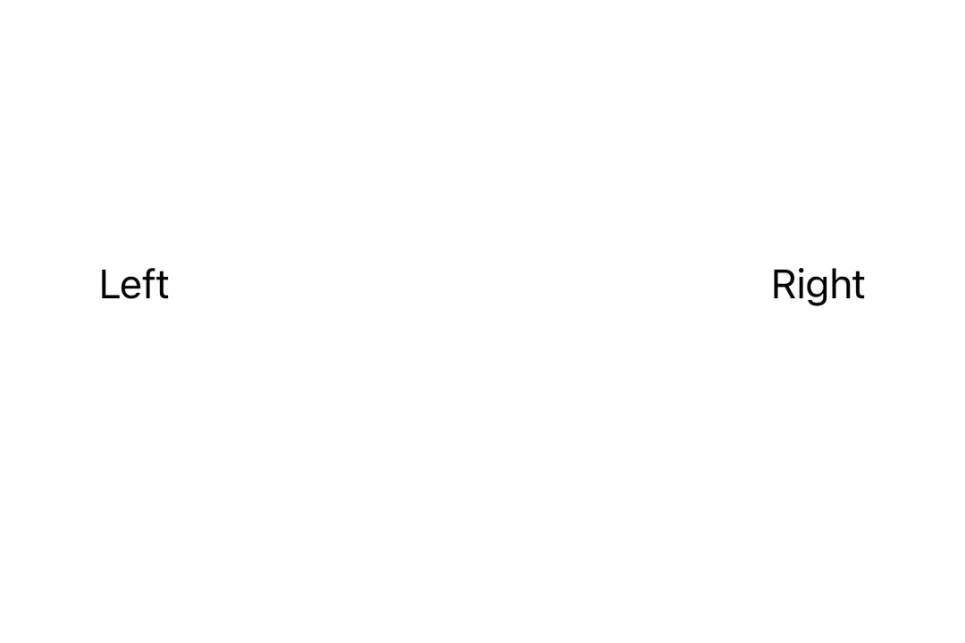
使用间隔器将内容推到水平堆栈的两端。
🌐 Use Spacer to push content to opposite ends of a horizontal stack.
SpacerHStackExample.tsx
import { Host, HStack, Text, Spacer } from '@expo/ui/swift-ui';

export default function SpacerHStackExample() {
  return (
    <Host style={{ flex: 1 }}>
      <HStack>
        <Text>Left</Text>
        <Spacer />
        <Text>Right</Text>
      </HStack>
    </Host>
  );
}
VStack 中的基本间隔符
🌐 Basic spacer in VStack
使用间隔器将内容推到垂直堆叠的两端。
🌐 Use Spacer to push content to opposite ends of a vertical stack.
SpacerVStackExample.tsx
import { Host, VStack, Text, Spacer } from '@expo/ui/swift-ui';

export default function SpacerVStackExample() {
  return (
    <Host style={{ flex: 1 }}>
      <VStack>
        <Text>Top</Text>
        <Spacer />
        <Text>Bottom</Text>
      </VStack>
    </Host>
  );
}
应用接口
🌐 API
import { Spacer } from '@expo/ui/swift-ui';
Component
Type: React.Element<SpacerProps>